
Landing page kit / Design system
Enabling the Thriva team to create landing pages at speed
Thriva is a health tech start up that lets people take control of their health with at-home blood-testing. As the company grew, marketing campaigns became more important, as did a CMS to create campaign-specific landing pages.
YEAR
2021
MY role
Product designer
Services
UI design
Design system documentation
The challenge
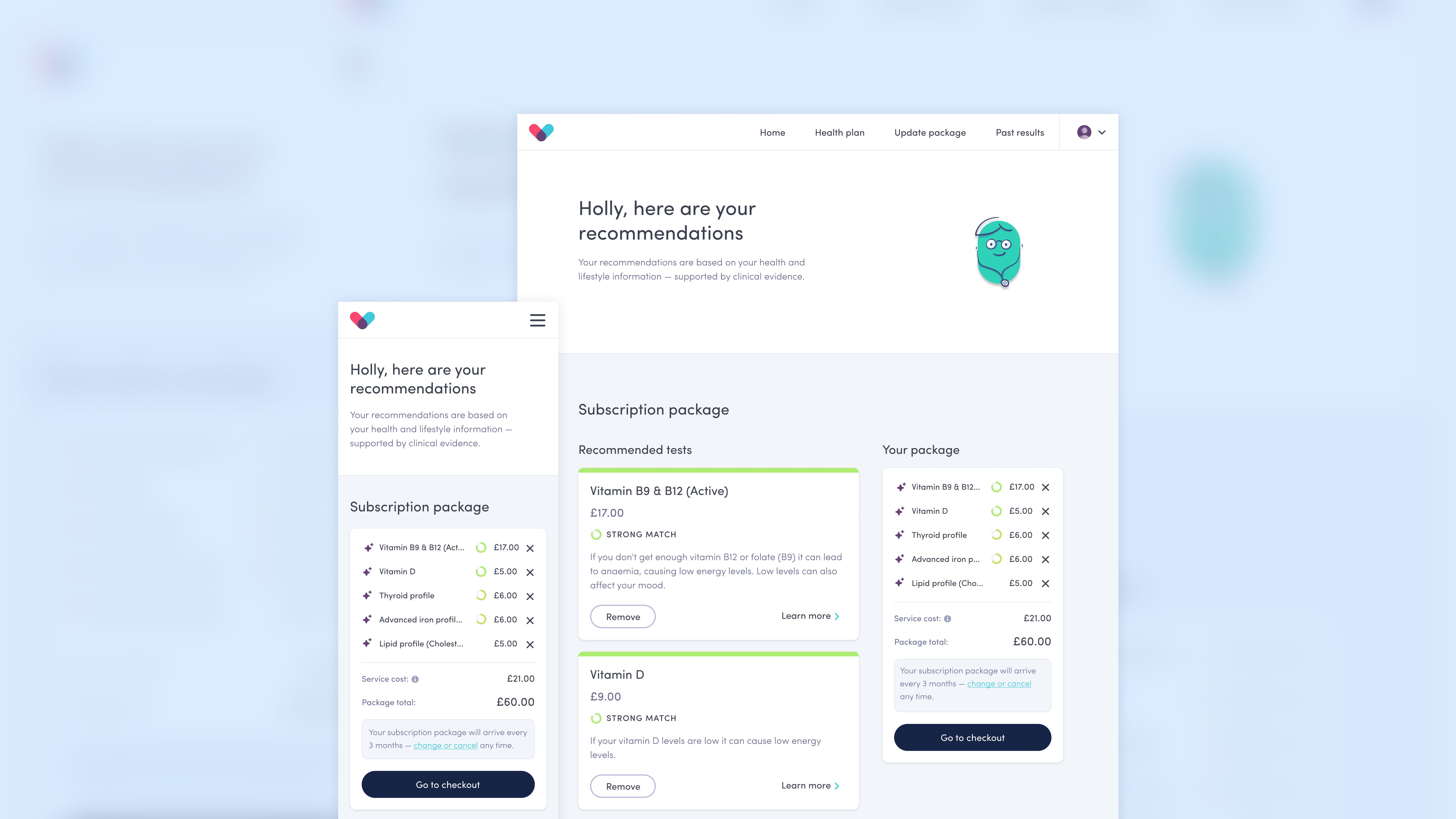
The Growth team at Thriva wanted to create landing pages with a CMS for various marketing campaigns. I was asked to design a set of components that would allow them to make a variety of basic landing pages.
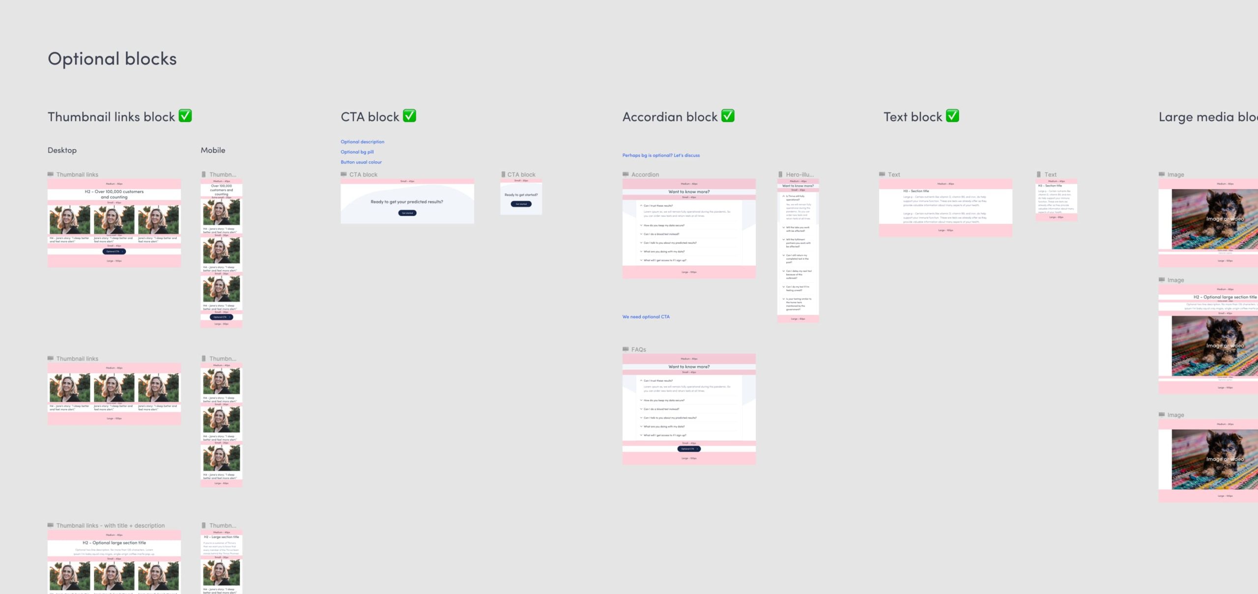
Defining the blocks
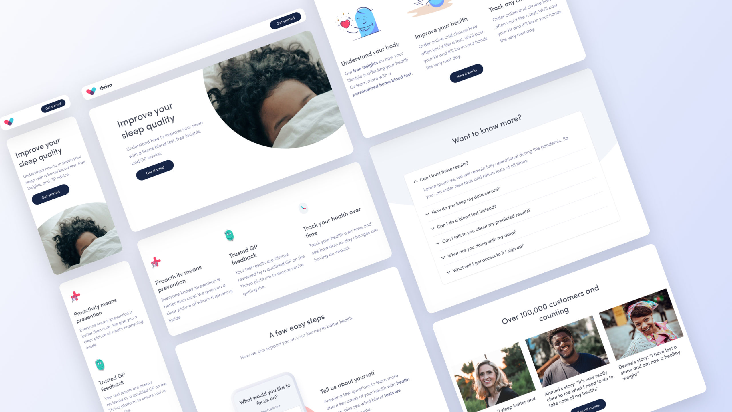
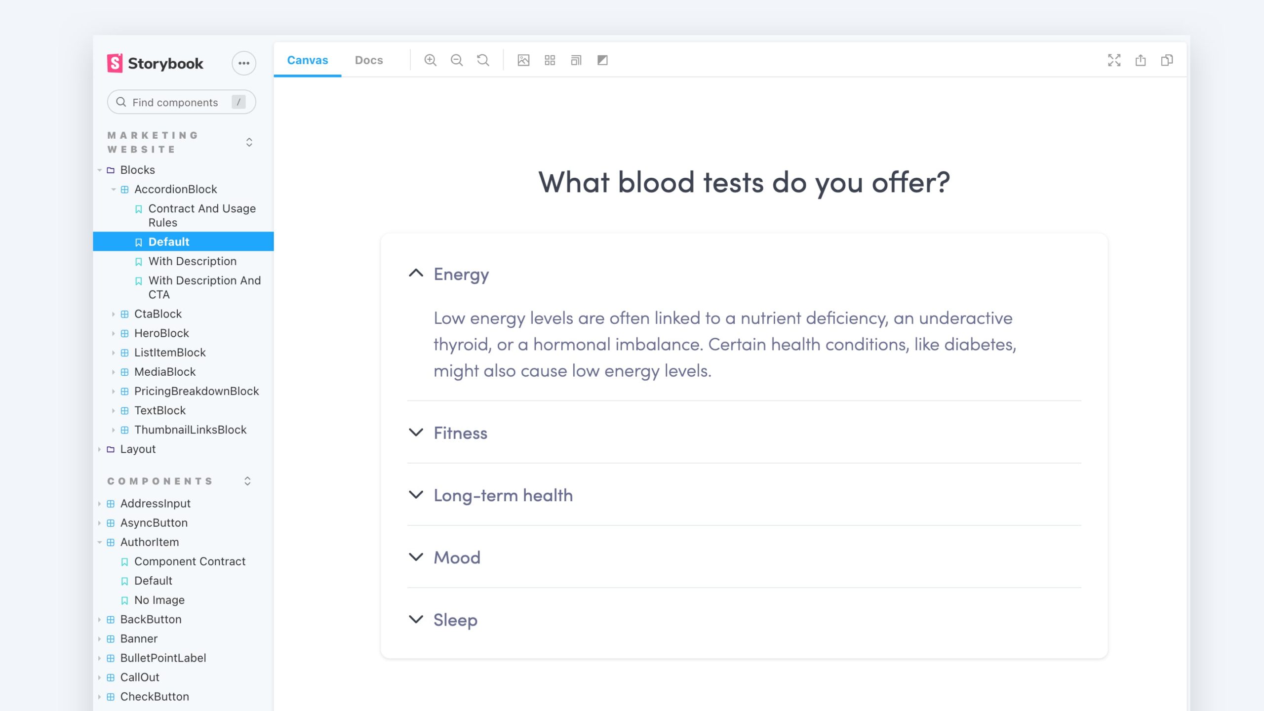
I defined a minimum set of 'blocks' that would allow the team to create a range of basic landing pages. I chose the blocks based on the most used components on the Thriva website. I also chose components that were adaptable and allowed for visual variety.
Creating a system
I thought carefully about the padding of the blocks so they'd fit together well when used together. I worked closely with the developers to make sure we were using consistent spacing classes. This meant we could easily adjust the spacing and see what worked best.
To make the blocks as reusable as possible we made sure we had a consistent naming convention – one that was easy for the whole company to understand. In the end we settled on 'components' and 'blocks'. This was easiest for everyone to understand and wasn't platform specific terminology so could be reused across the product.
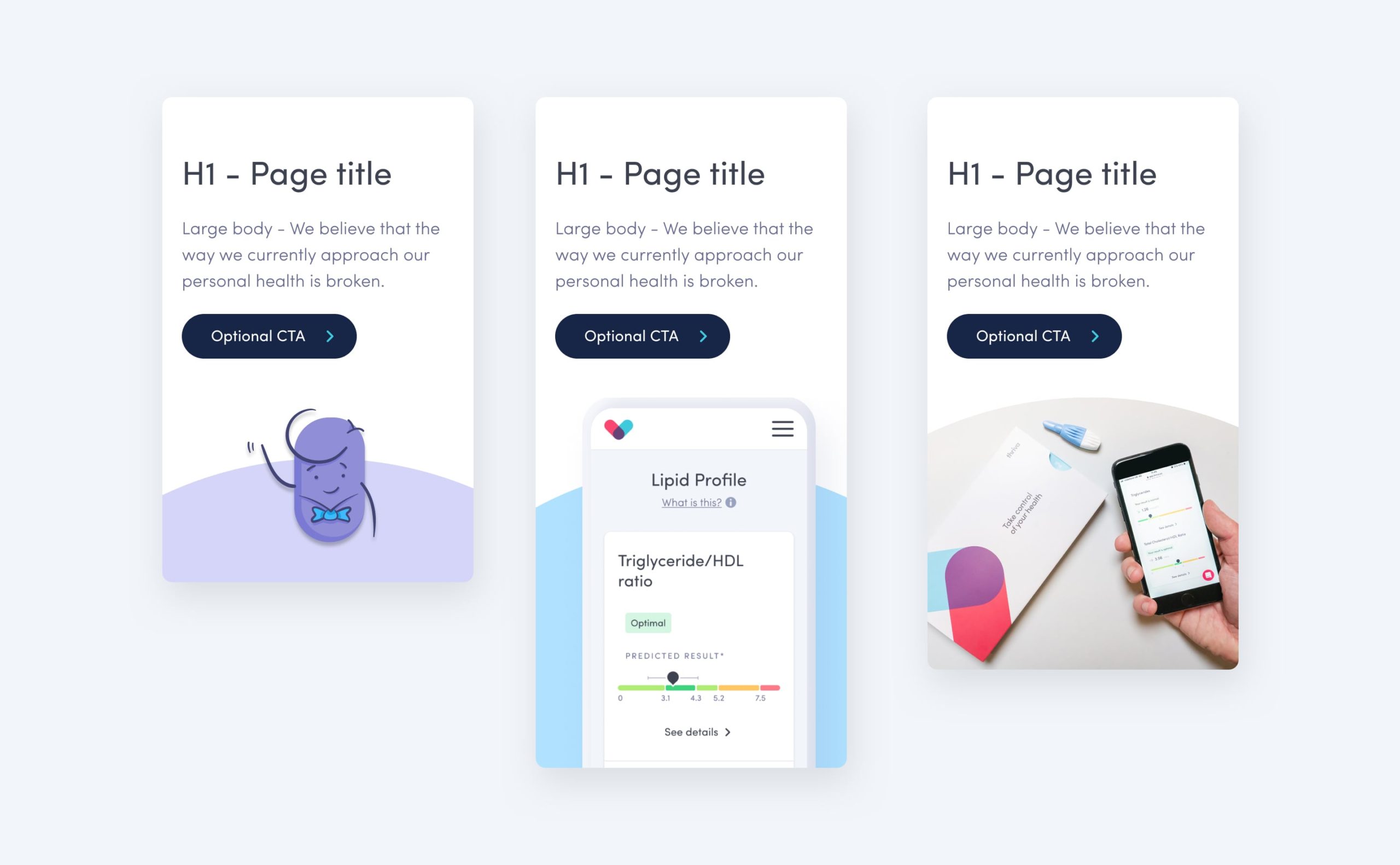
For some of the blocks, I designed variations for different use cases. For example, for the hero component I created three versions: one for an illustration, one a product shot, and one a photo. This meant the team had flexibility to use the best/most appropriate assets for the page subject.
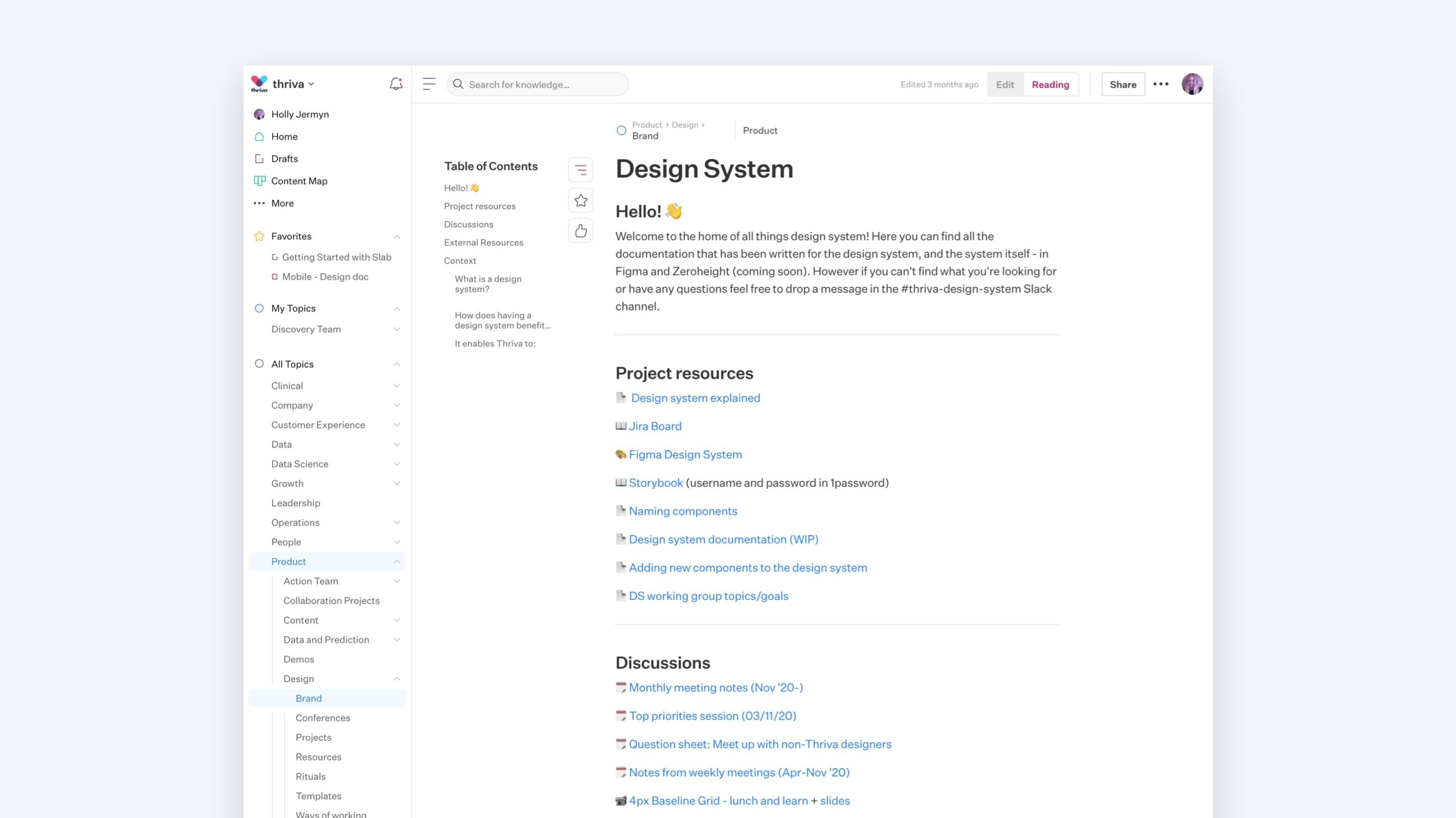
Documentation
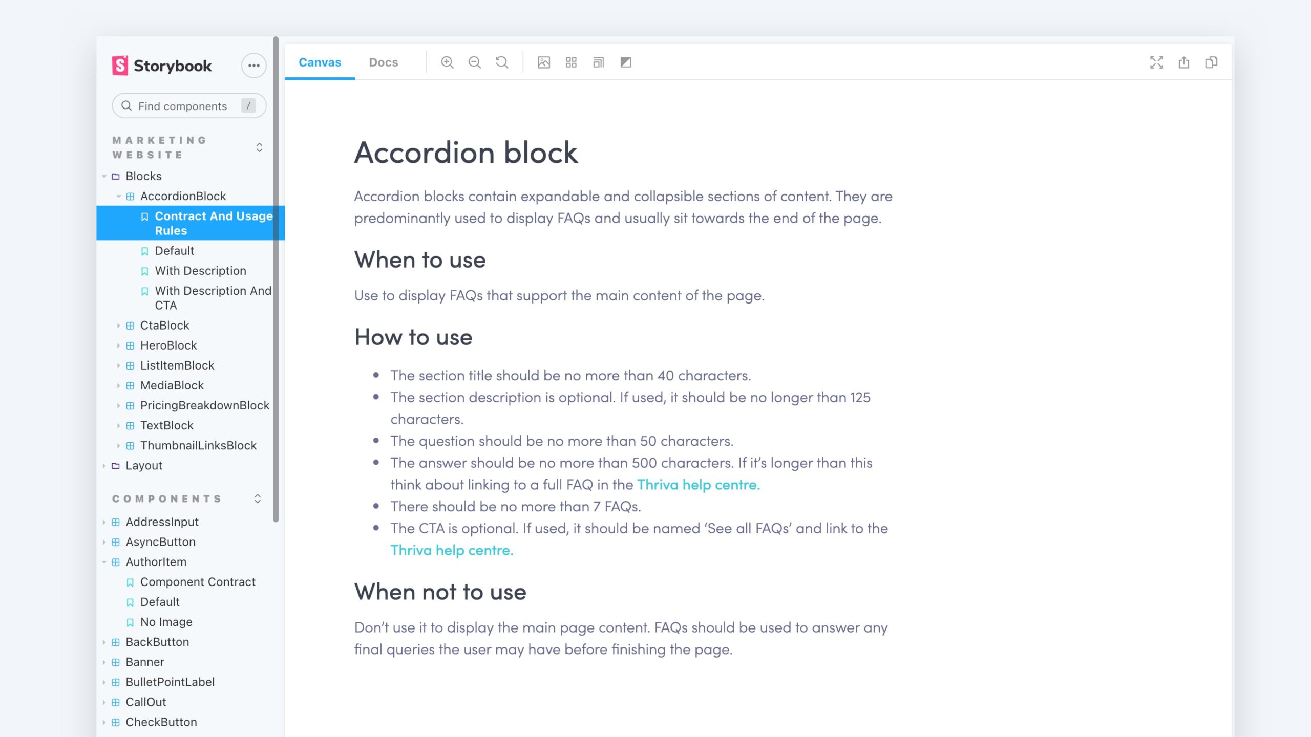
I created usage rules for the blocks. The purpose was to explain how each of the blocks should be used i.e. for what type of content. The developers and I used Storybook for this as it's easy to share with the whole company. Plus, it's easy to use.
Project evolution
Off the back of this project, the developers and I set up a design system working group. We wanted to create better documentation for the design system and a better process for adding to it. We realised that product teams had been working in silos when creating new components. There were many instances of duplicate components that had been designed and built by different teams.
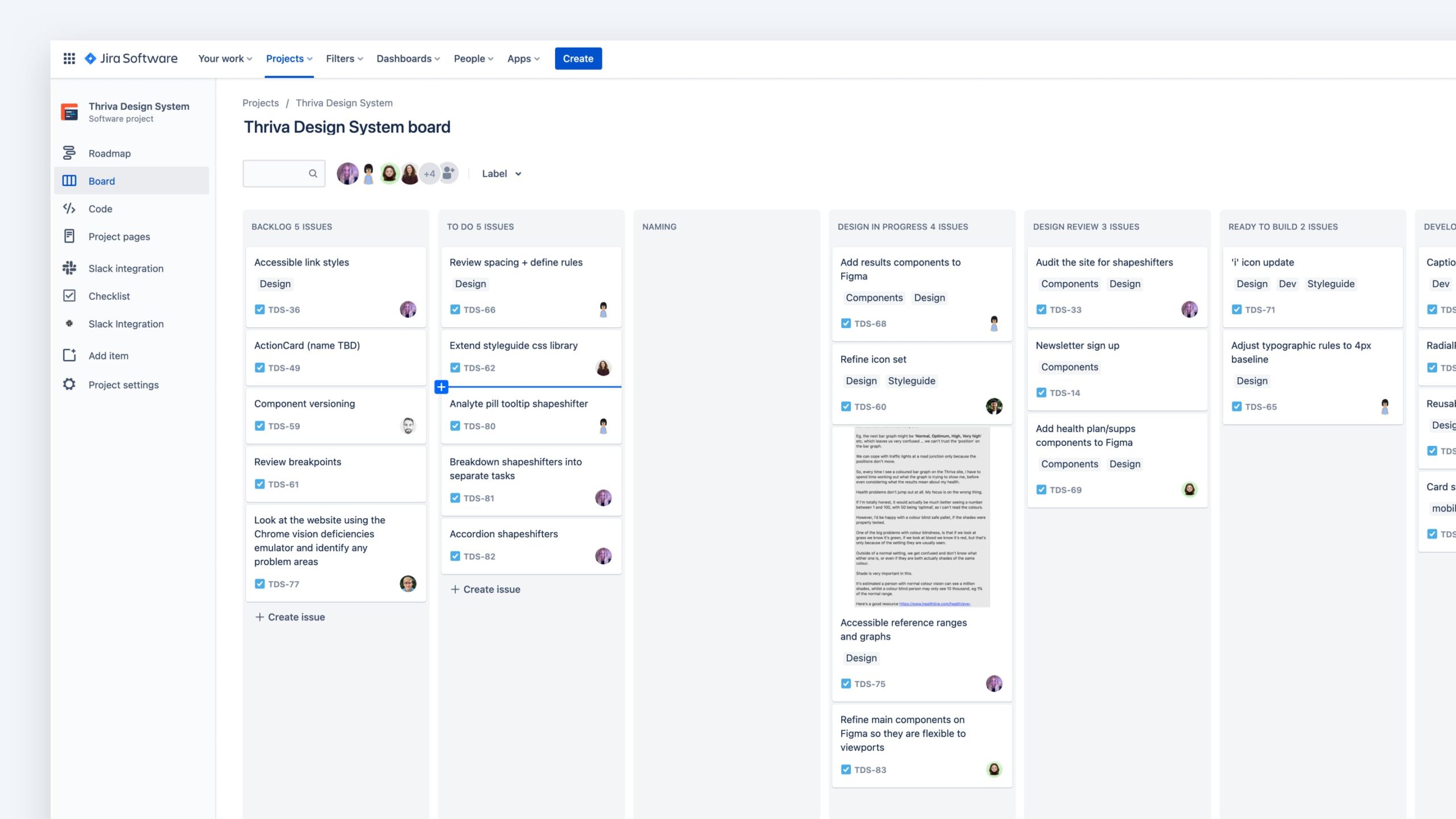
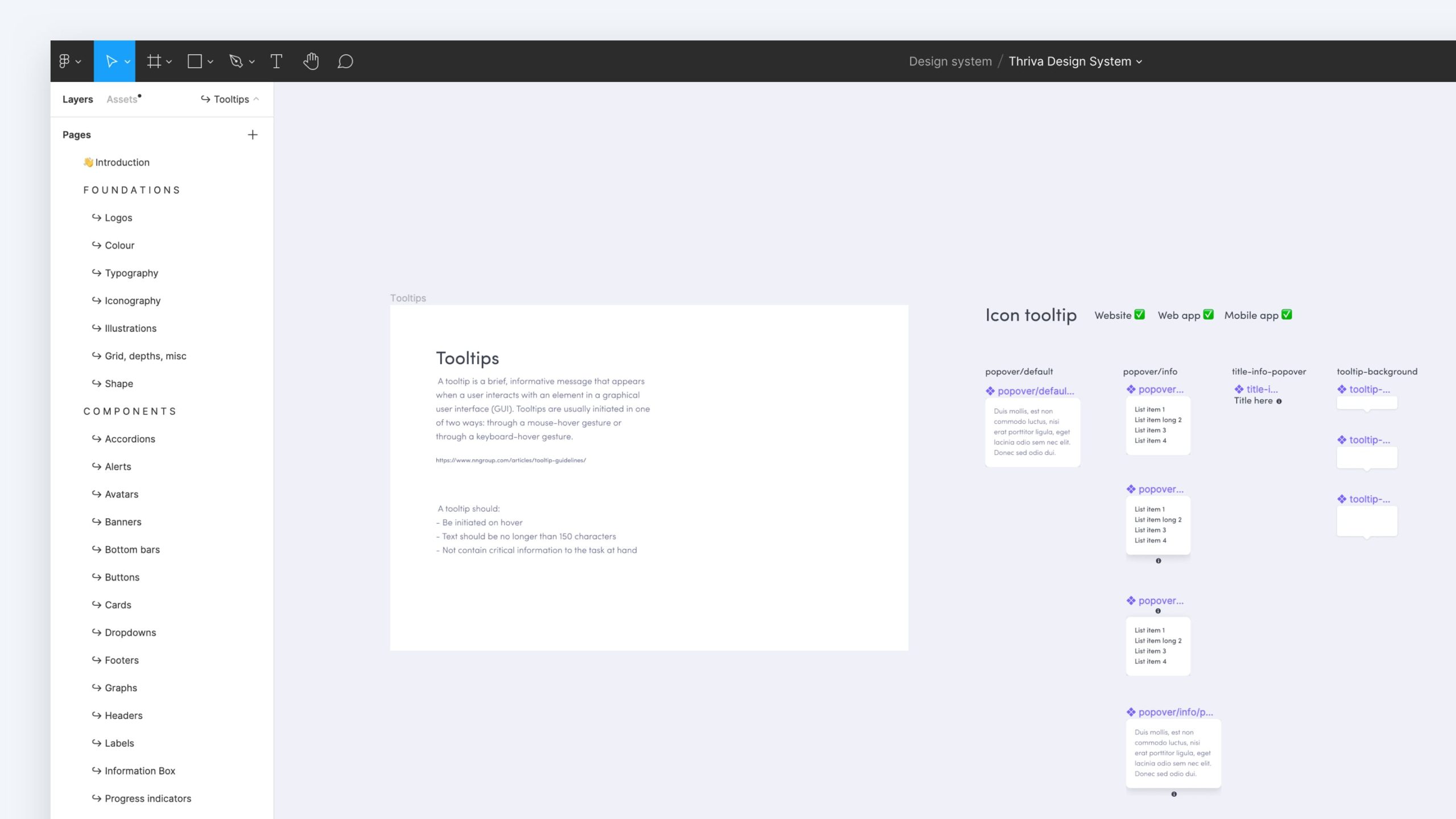
As part of the working group, we set up a Jira board to track tasks. We had weekly catch ups to review our work on and decide priorities. My tasks included a component audit, tidying the design system Figma file, and setting up our design system documentation. I led the team, running the weekly catch ups, distributing tasks, and setting up a Slack group to keep conversation flowing.
Results & learnings
The Growth team has now made dozens of landing pages using the CMS. This was a huge win because it meant design and development time wasn't needed to create these pages. The team can also run more experiments and learn faster.
The work on the design system had a huge impact on the way designers and developers work together. More consideration goes into creating new components – and we don't create duplicates. It has sparked conversations about how to name components. We continue to discuss this in our design system Slack channel.
Some learnings:
• Make sure everyone understands the scope of the project. We didn't have a PRD or kick off meeting, which made it difficult to define the scope.
• Set aside time to review landing pages. Some components were used in unintended ways. To avoid inconstancies and poor visual design, I would plan time to review all landing pages.