
PRODUCT DESIGN
Improving the way tests are recommended at Thriva
Thriva is an at-home blood-testing company that gives customers an insight into their health. Blood test recommendations are a key part of the product. Thriva recommends a set of blood tests based on health information provided by the user.
YEAR
2021
MY role
Product designer
Services
Design thinking
Usability testing
UX/UI design
The challenge
We noticed a significant drop-off on the recommendations page, so chose to focus on this for the OKR period – to improve the purchase rate from 19% to 25%.
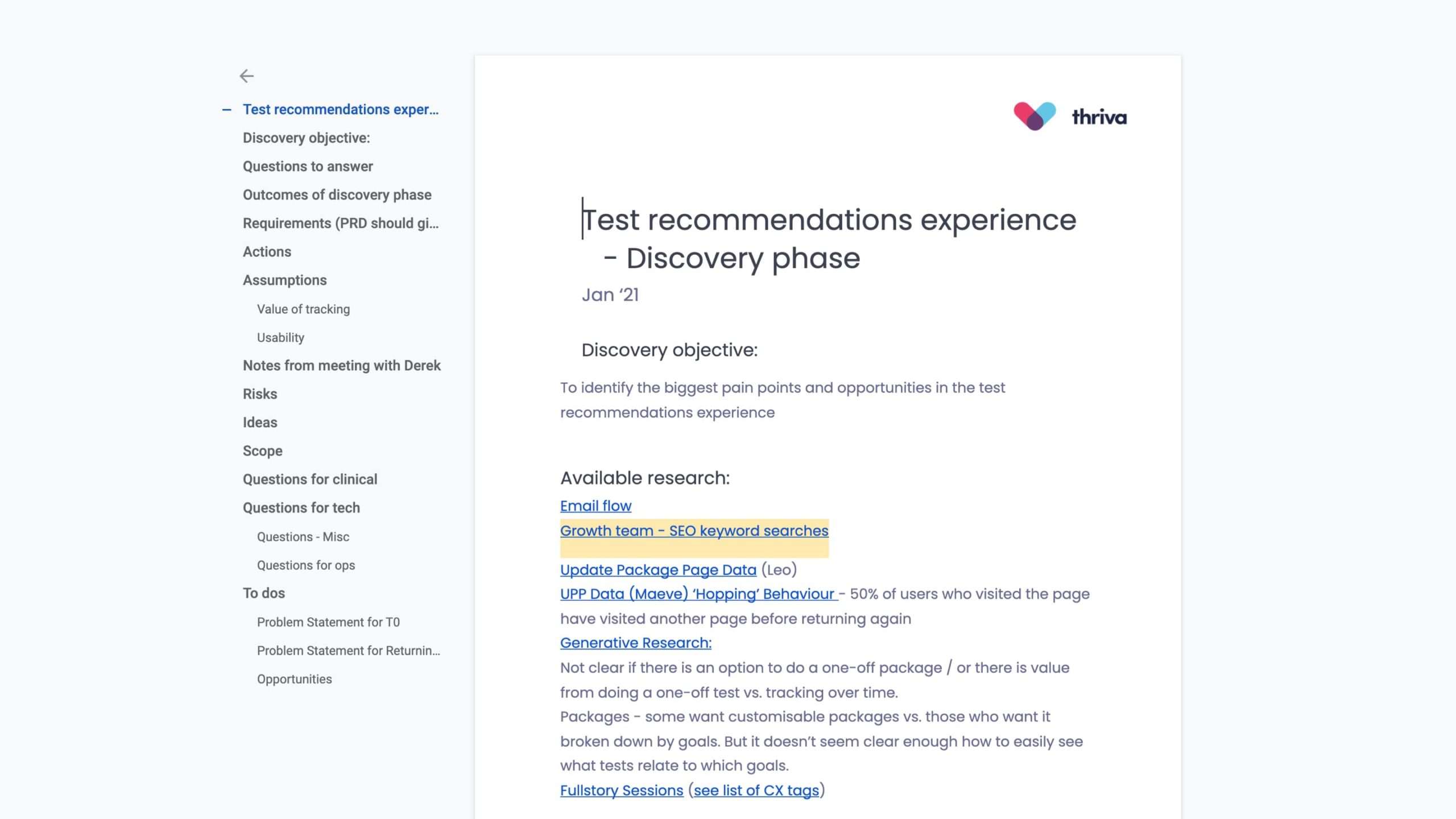
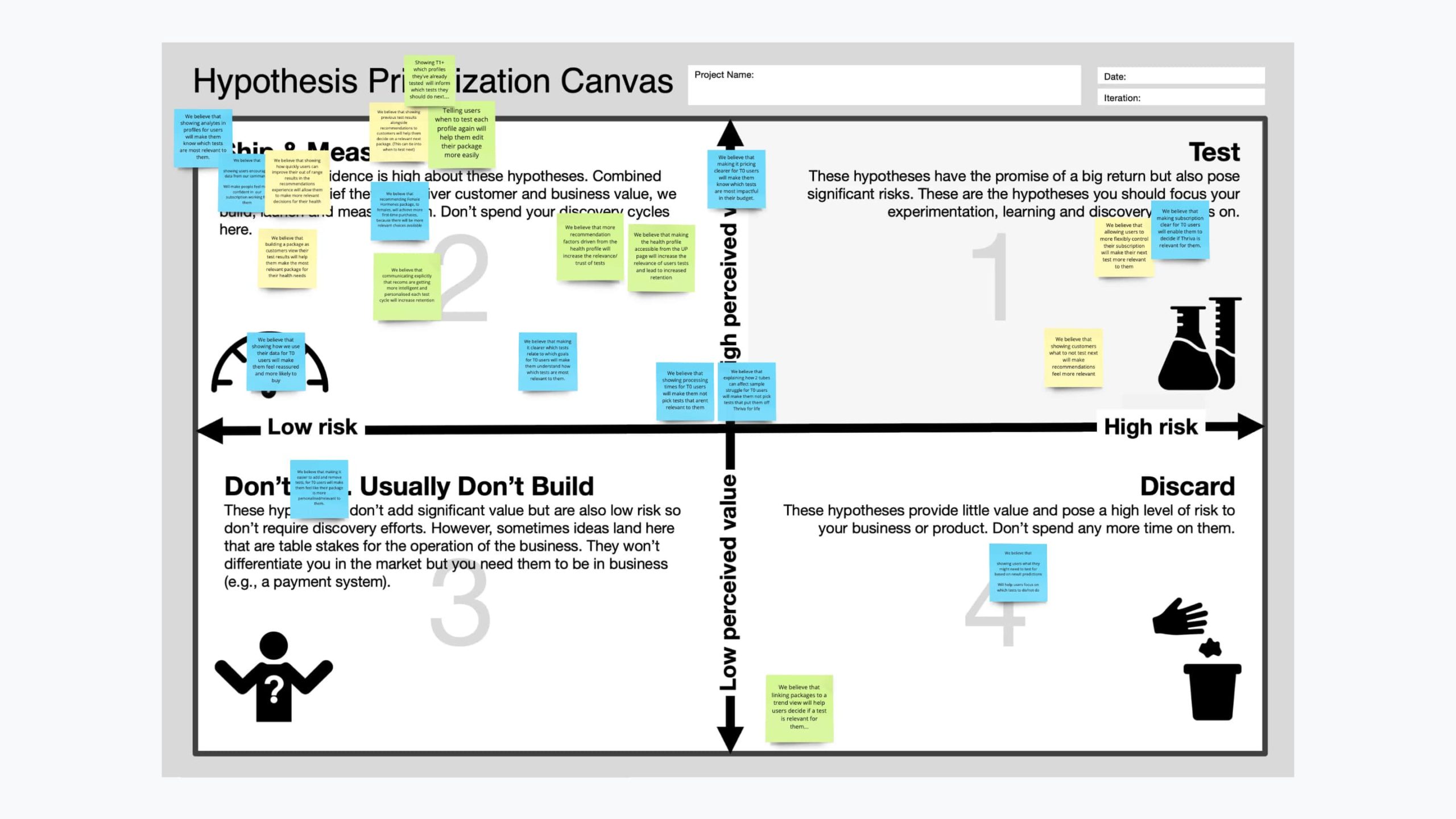
Discovery
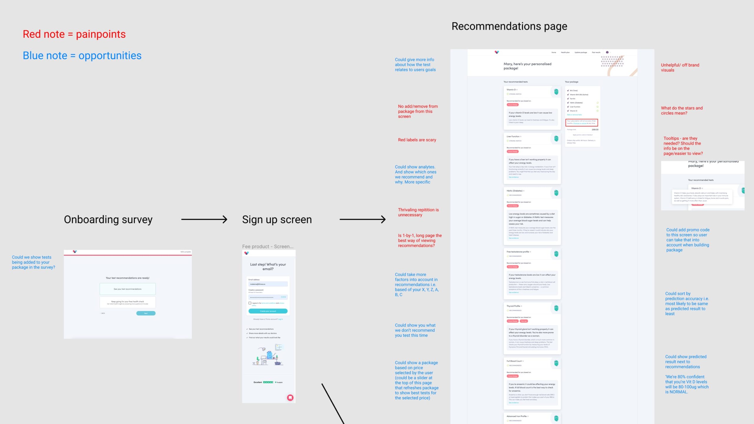
As part of the discovery phase, we reviewed the experience, ran an empathy mapping workshop, and a hypothesis prioritisation session. The opportunities for improvement were to:
• Show the price of individual tests
• Add more information about tests
• Show previous test results
• Show test cadence
• Recommend pre-built packages
• Reduce cognitive load on the page
• Make adding and removing tests easier
Design
I ran a sketching session to test our top hypotheses. We focused on:
• How might we recommend pre-built packages?
• How might we provide more information about tests?
• How might we reduce cognitive load on the page?
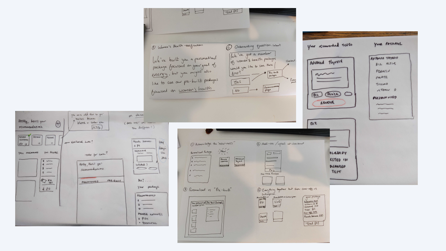
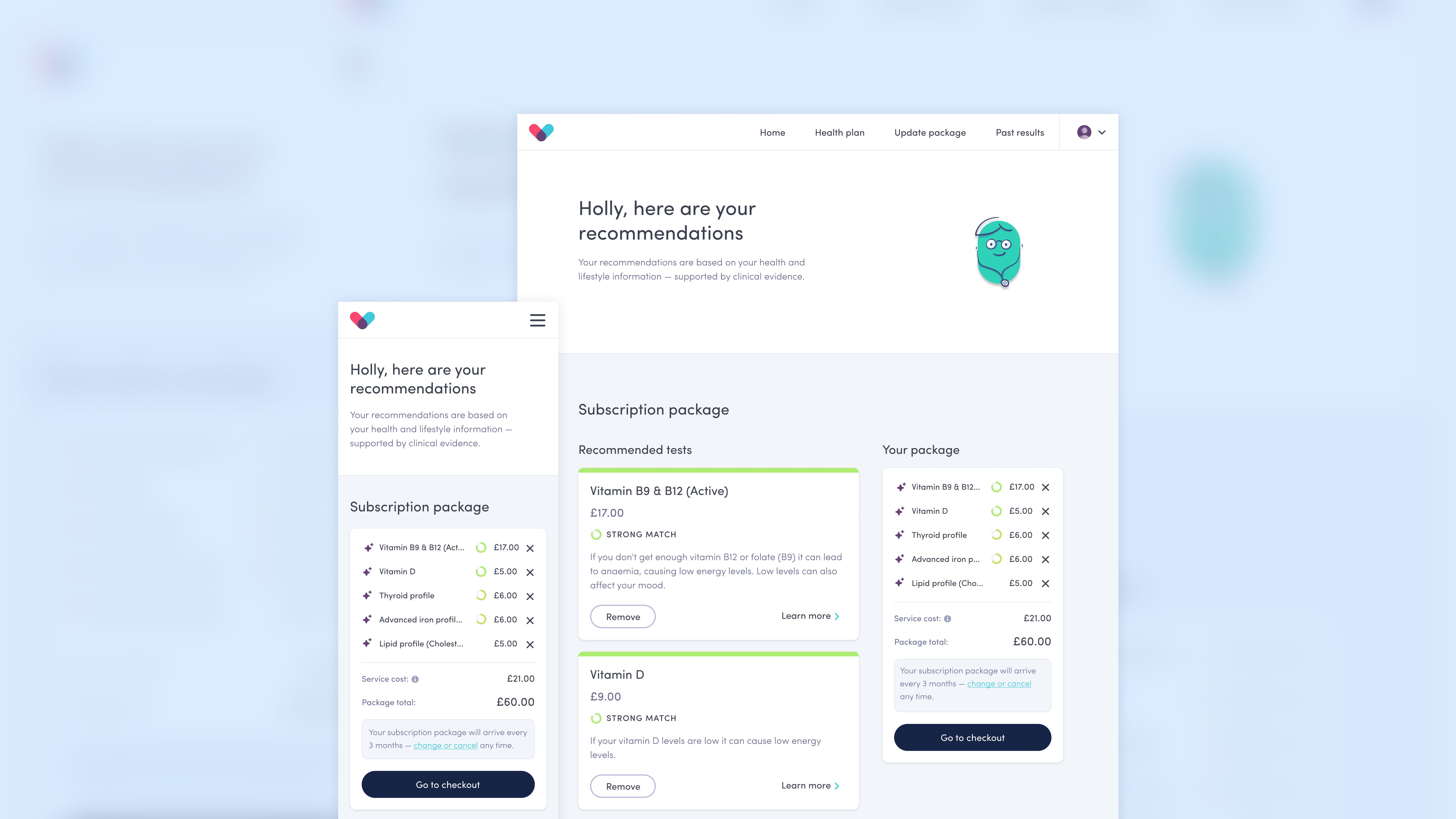
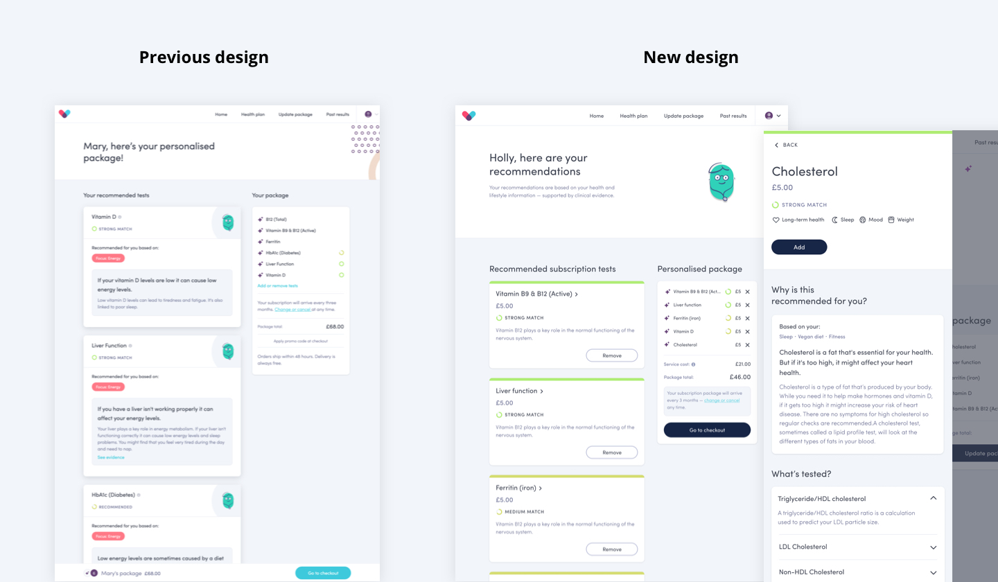
The final design included:
• The price of individual tests
• Clickable cards with full test information in a detail view
• Add/Remove buttons on cards to make editing the package easier
• Biomarkers and related health areas for each test
• Previous test results for existing customers
• A visual design clean up to rebalance the hierarchy of information
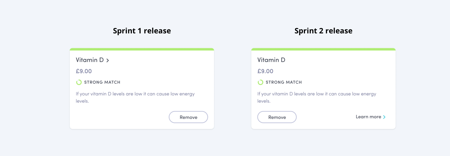
Research & data
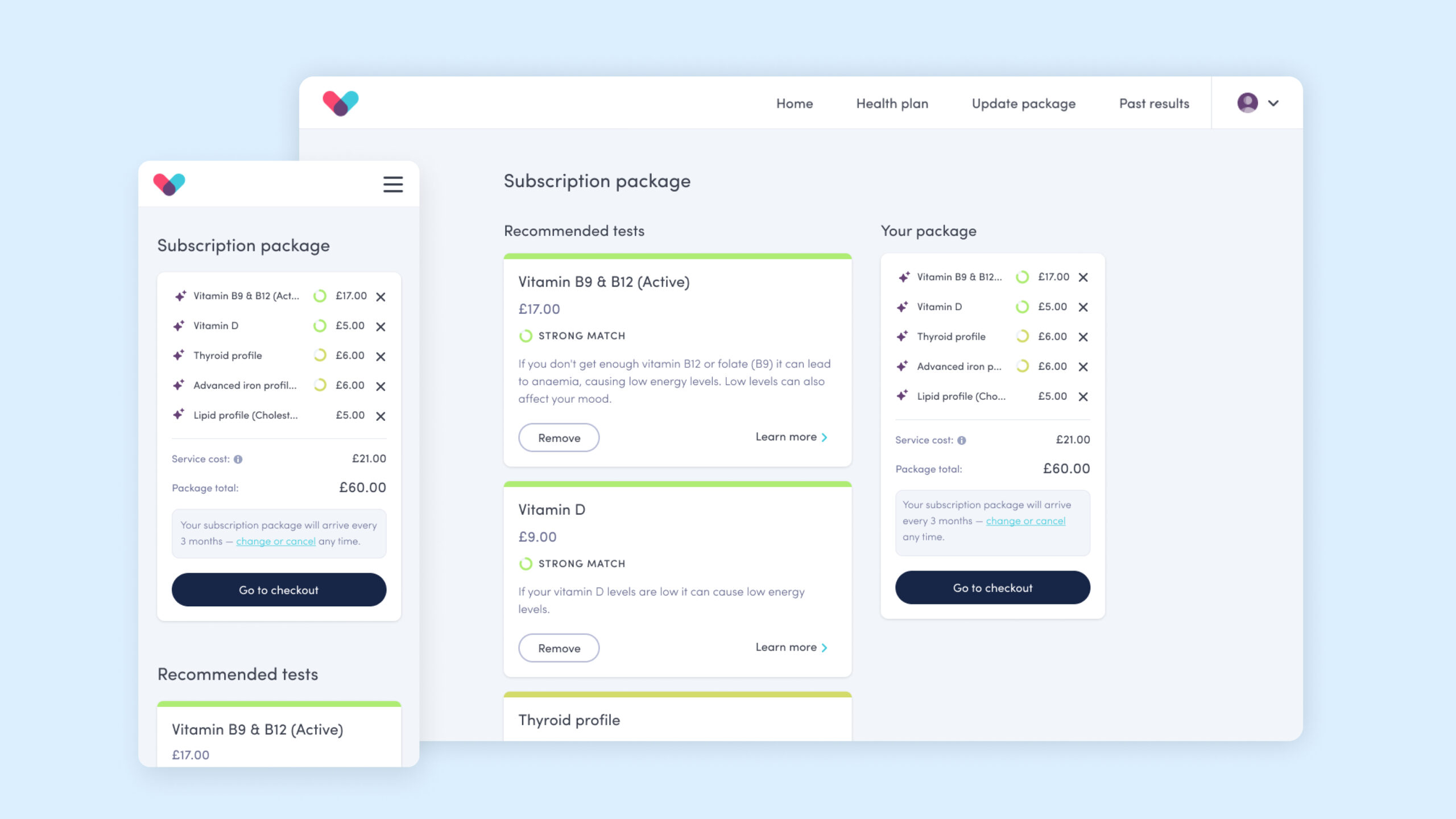
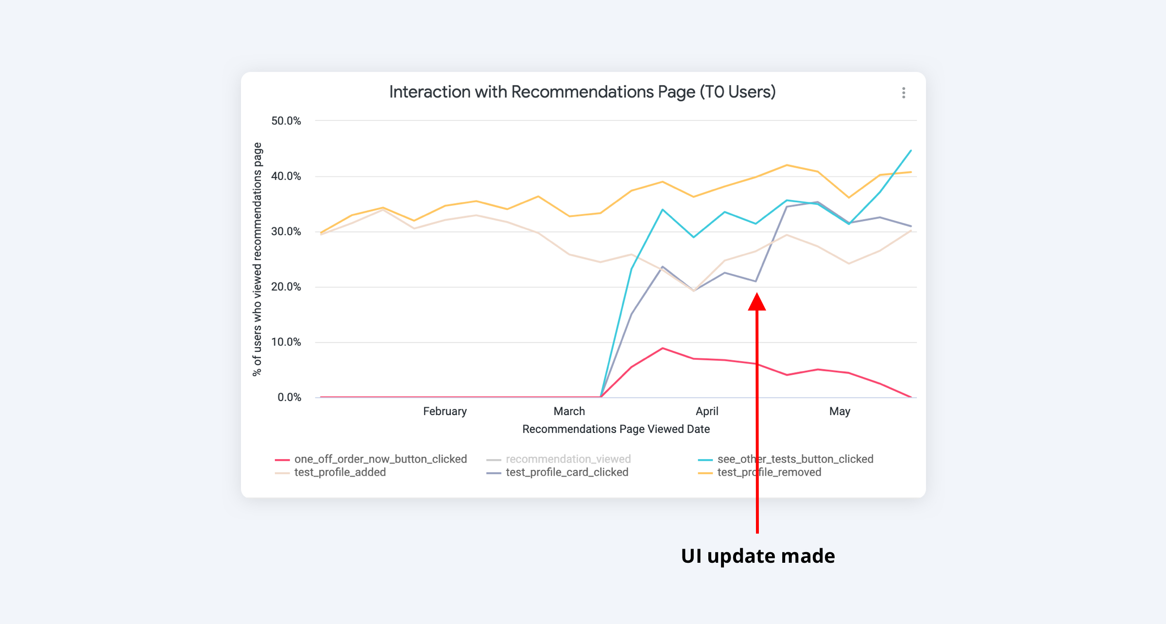
We carried out usability testing on the live web app and found that the designs worked well – only some small tweaks were needed. One finding was some users weren’t sure whether the cards were clickable.
The quantitative data showed the card click-through rate was much lower than other interactions on the page.
The fix
I chose to add a 'Learn more' link to the cards. I chose link styling to give the right level of prominence to the action.
We monitored the data after release and found that the click-through rate increased significantly.
Learnings
Some key learnings from this project were:
• Think content first. Don’t jump into the UX before you’ve considered content.
• Don't underestimate the impact of small UI changes.
• Test one thing at a time. Lots of changes make tracking performance difficult.