MOBILE app DESIGN
Giving Maserati owners a new type of car manual
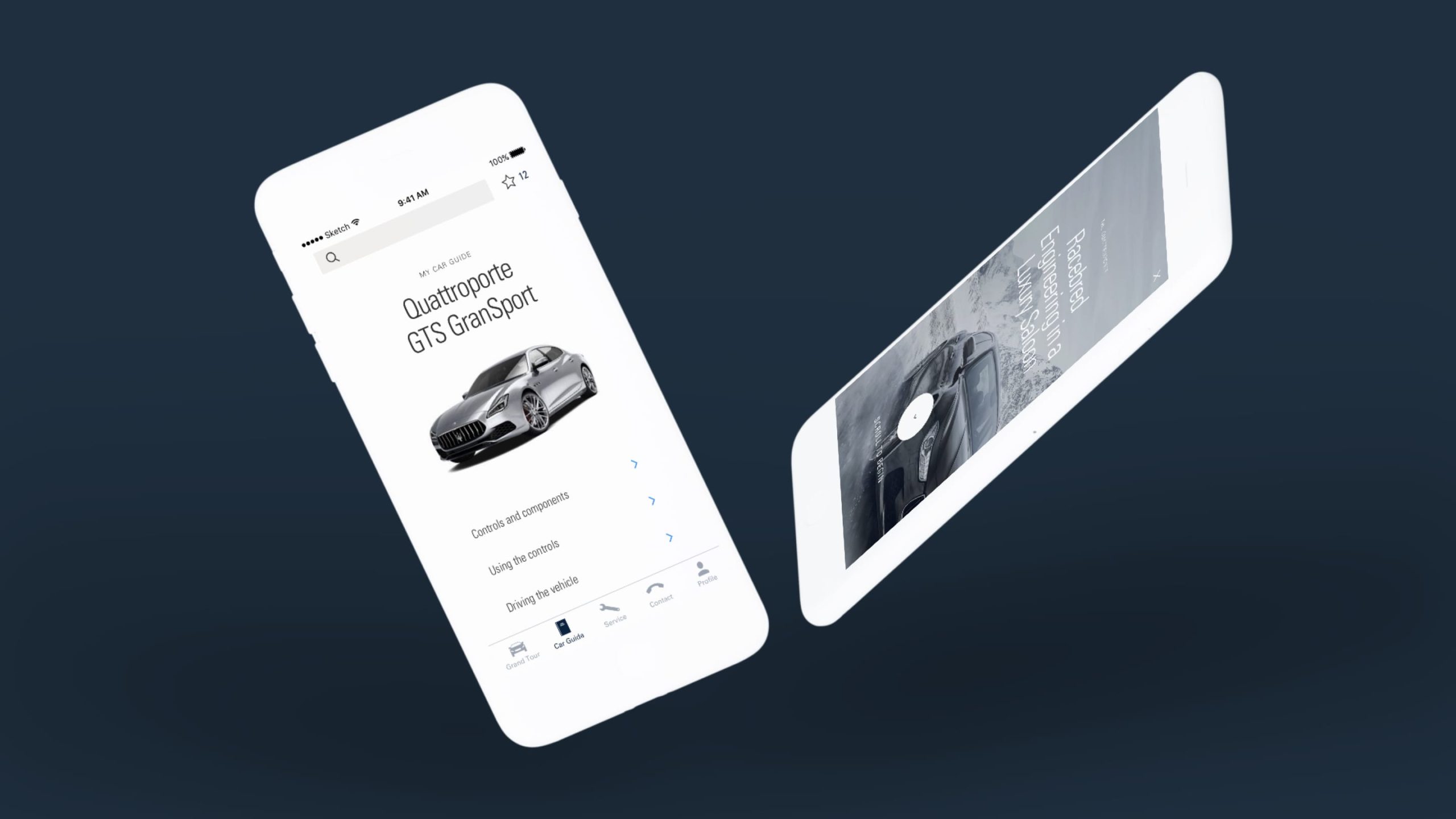
Maserati wanted a customer experience that matched its premium offering. The answer was a mobile app for owners.
I took over as the lead visual designer halfway through the project and worked closely with the UX lead to create the final designs.
YEAR
2017
MY role
Visual designer
Services
Visual design
Mobile app design
The challenge
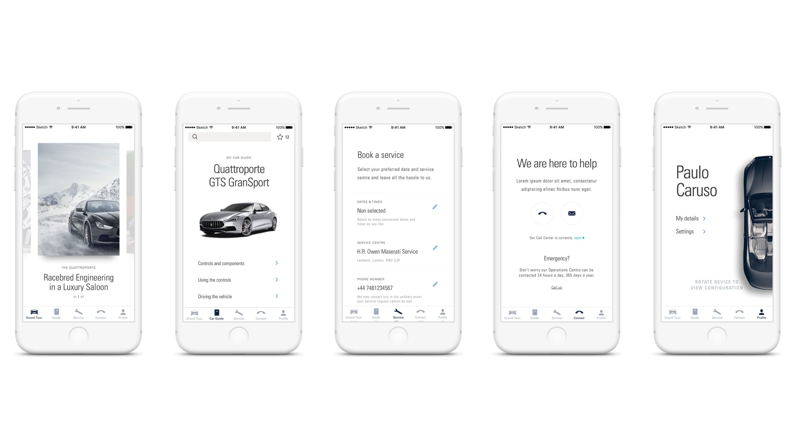
Maserati wanted a mobile app for customers that worked as a car manual, service booker, and hub for exclusive, interactive content.
When I joined the project, the UX work was almost complete. The previous visual designer had made a good start on defining the look and feel of the app. My task was to take the defined style and apply it to the rest of the app, as well as work with the UX designer to refine ideas for the remaining sections.
Process
I started by taking the wireframes and applying the look and feel, trying out different ideas for key screens. I worked through most of the project this way - creating options and sharing with my team until we achieved the right result.

Exploring different layouts
The solution
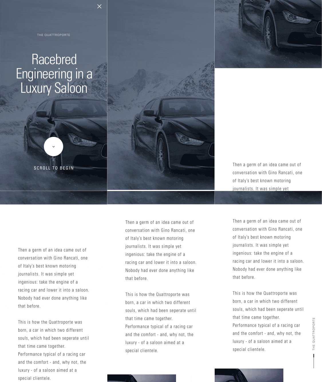
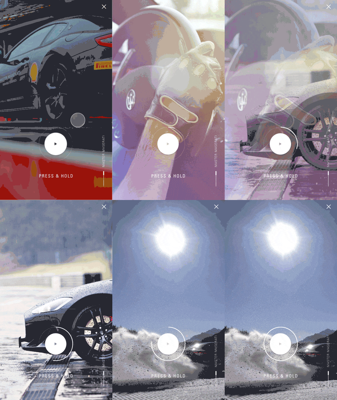
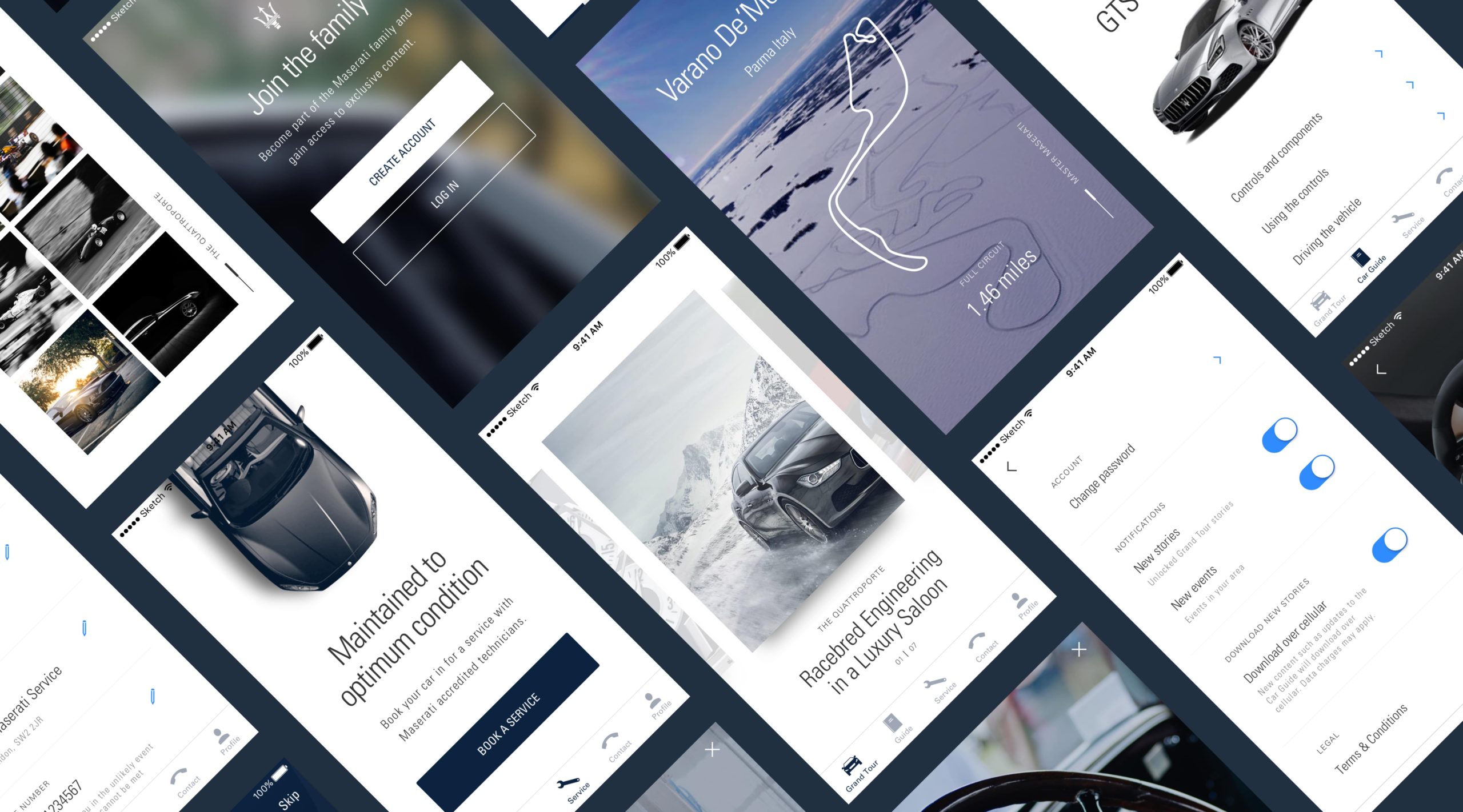
An app that was both functional and beautifully styled. The Maserati colour palette of dark blue and white was carried through the whole app to create a coherent look and feel – with pops of bright blue for accents. White space alongside tonal photography created contrast in colour and texture between screens. I used photography for backgrounds with clean white text and graphics to create a sharp, luxurious feel.
I created animations for key parts of the app to show how screen transitions and interactive elements should behave. To continue the elegant, luxurious feel, I used lots of easing so the content gently glided into place.
