website DESIGN
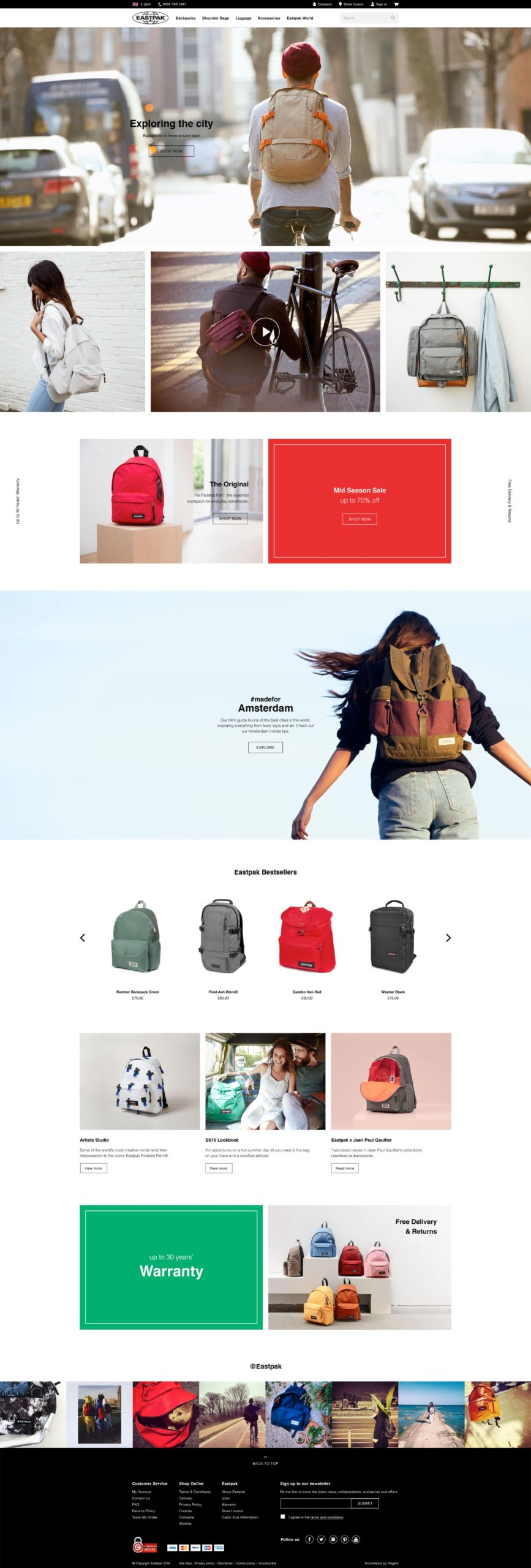
Refreshing Eastpak's website
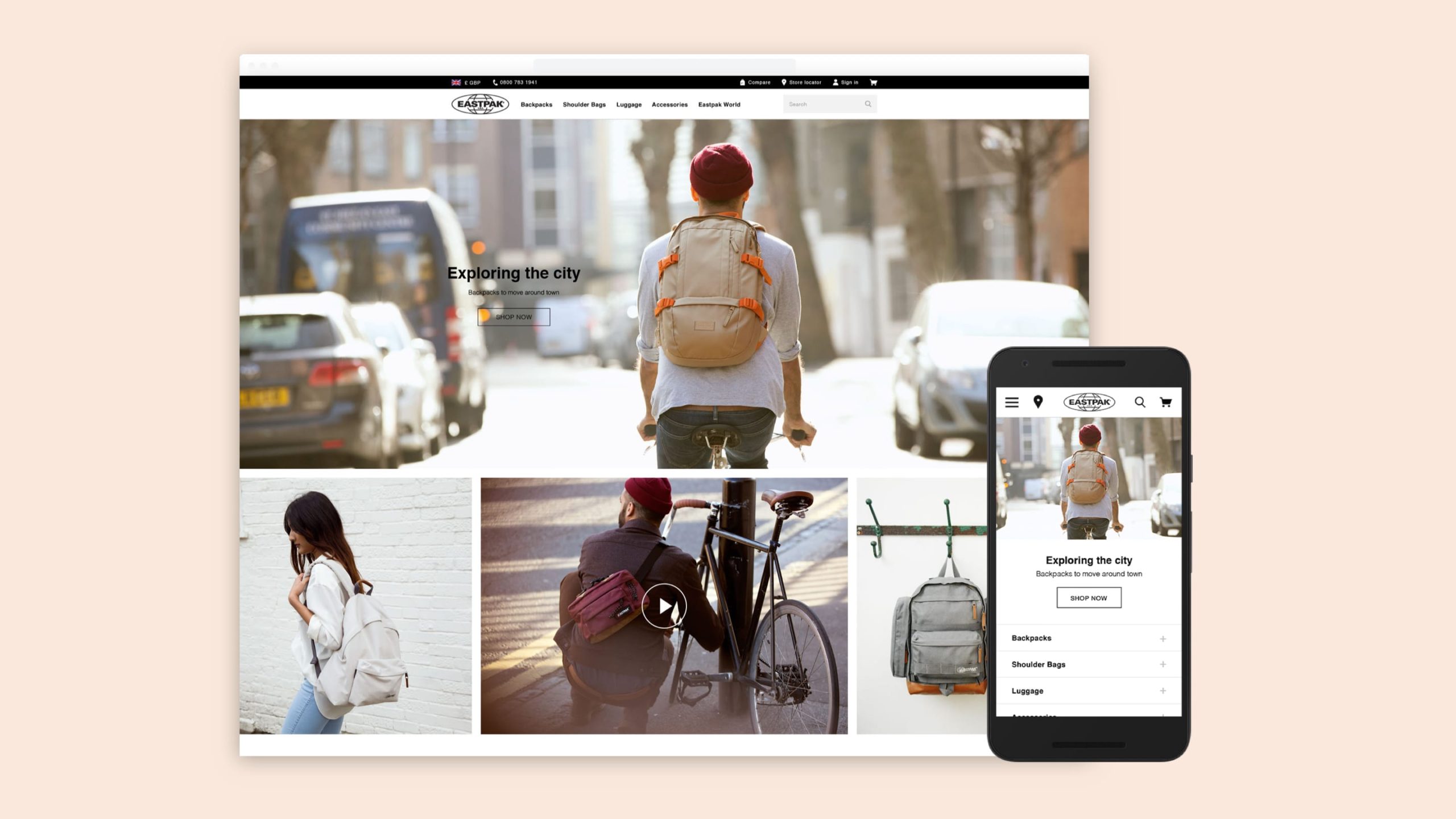
Eastpak is known for it's hard-wearing yet fashionabe backpacks. The website needed a refresh to better reflect their brand image.
I was the lead designer on this project, responsible for the overall look and feel of the site and minor UX changes.
YEAR
2015
MY role
Digital designer
Services
Visual design
UX design
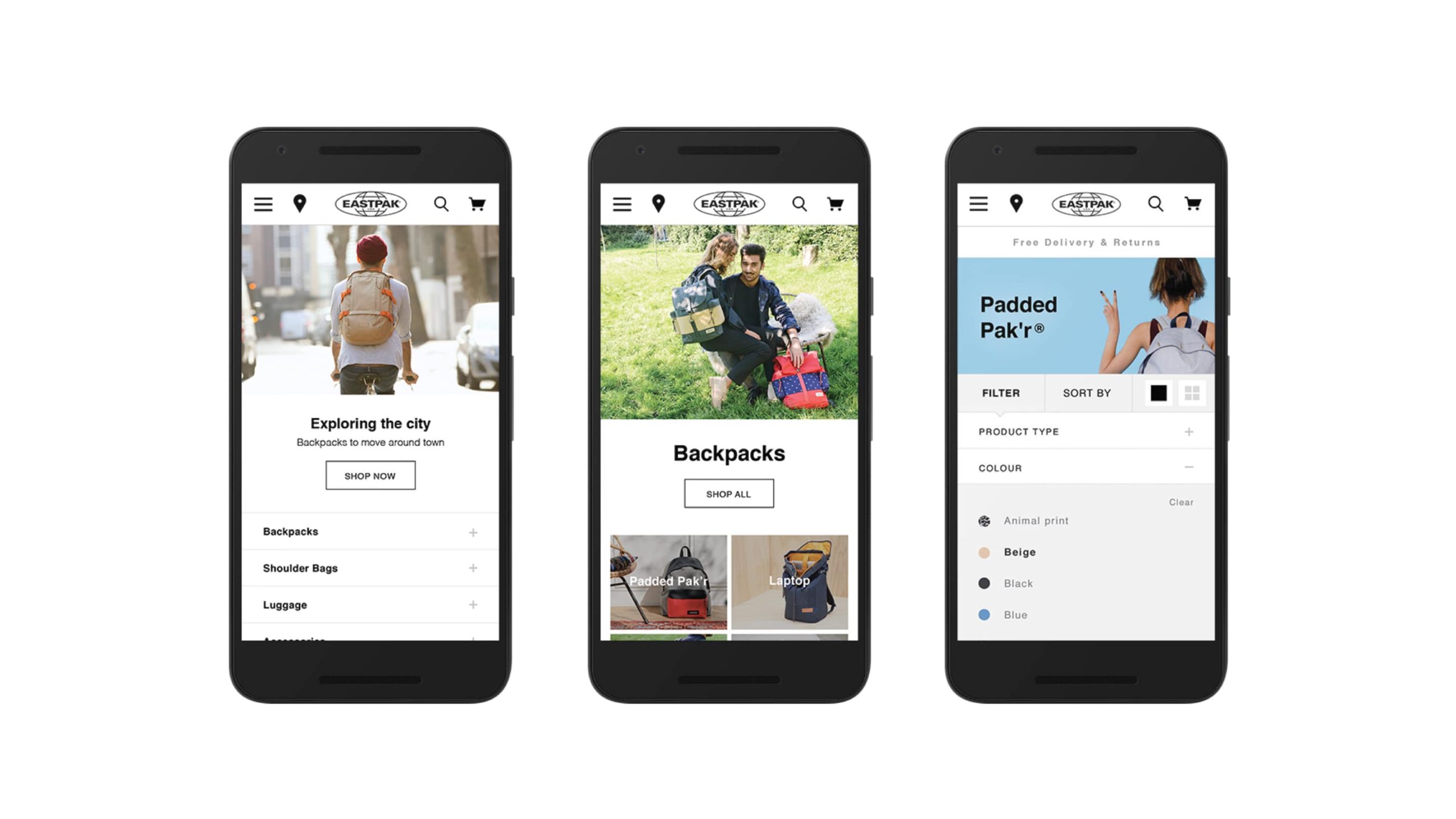
Responsive web design
The challenge
Eastpak wanted to refresh their Europe website. The existing site didn't reflect the brand personality. The client wanted a website that spoke to the target customer - young, urban, and ready for an adventure!
The solution
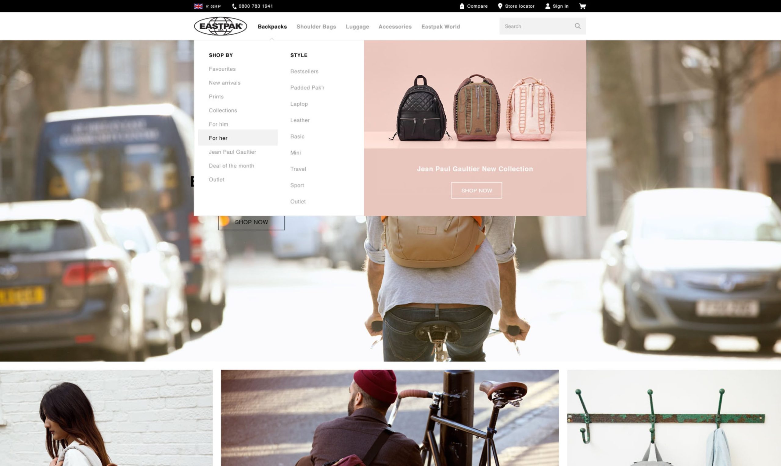
Re-designing the dropdown menu, introducing landing pages with key product categories and rethinking the filtering system to help the user find the right products for them.
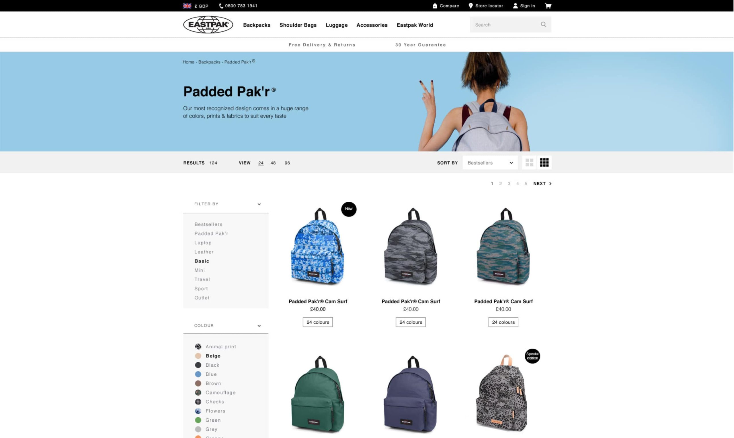
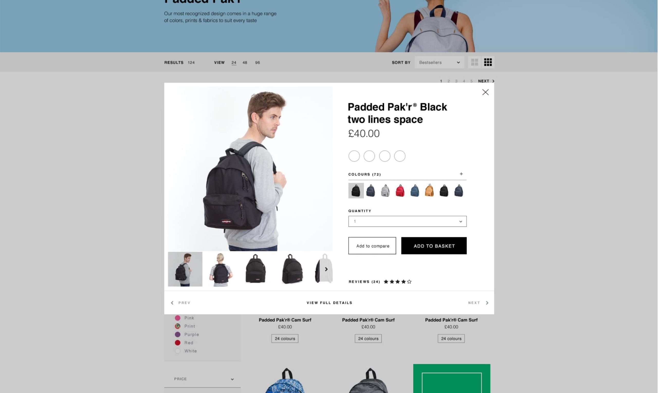
I created a new visual language for the brand online, taking inspiration from existing material to create a modern style that better reflected Eastpak’s personality. This meant defining the typography style, choosing the right photography, and designing responsive page layouts that were easy to update with the CMS.
