Mobile app design
Iona: An app for anxiety
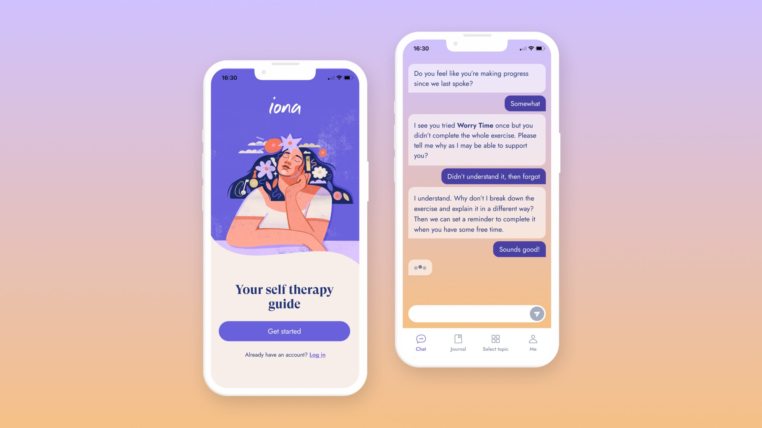
Iona is a self therapy app that gives users tools to manage their mental health. The company wanted to expand the offering to include a new app focused on helping people with Generalised Anxiety Disorder (GAD) to manage their symptoms.
YEAR
2022
MY role
Senior product designer
Services
UX/UI design
Design thinking
The challenge
To create an app that is clinically effective at relieving symptoms of Generalised Anxiety Disorder (GAD).
Discovery
In the discovery phase I interviewed the founders of Iona to better understand the goal of the app and gather learnings from building the first Iona app.
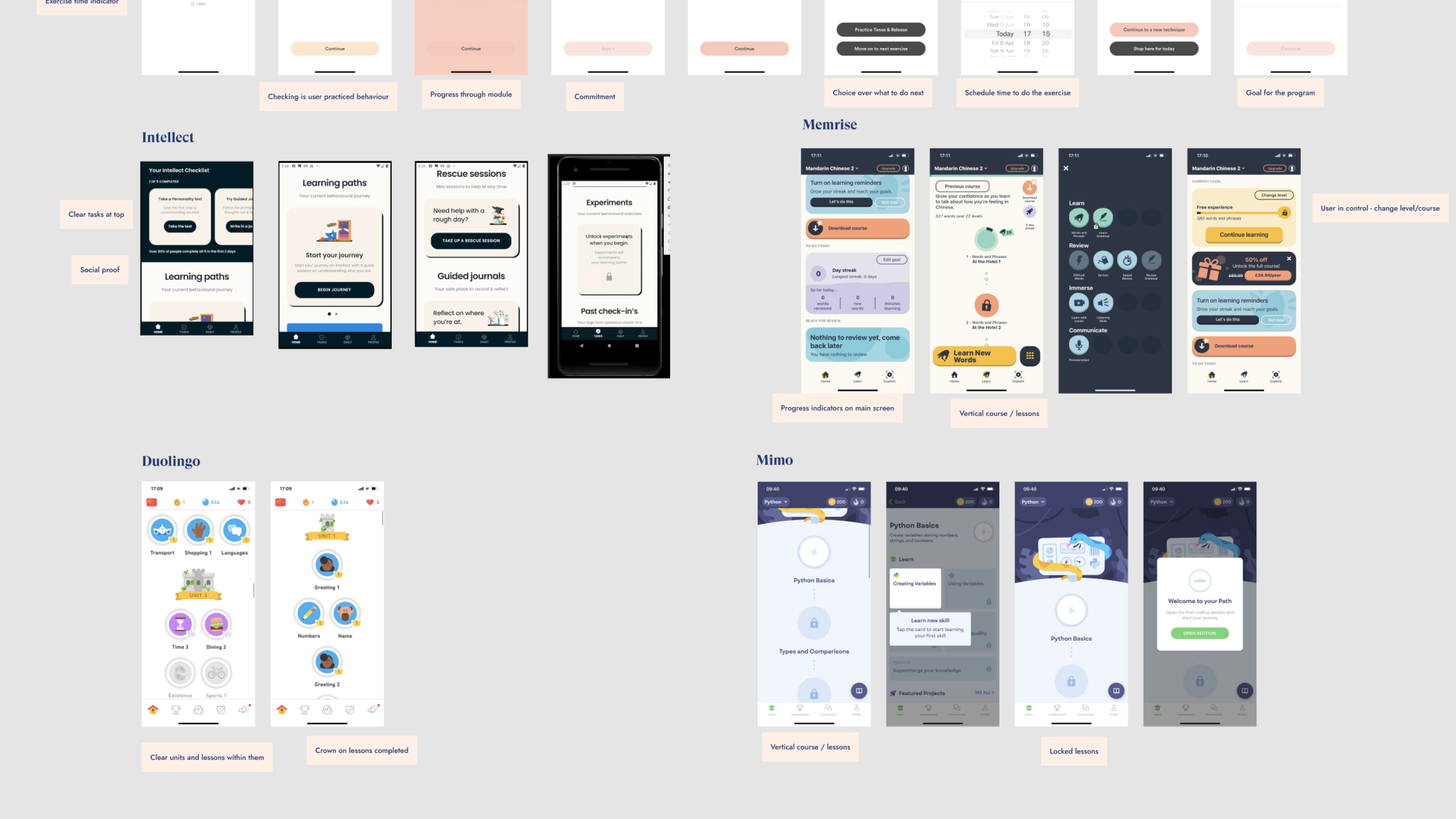
I reviewed existing research such as user interviews, surveys, and app store reviews to get a better understanding of who the user was and what they liked/disliked about the existing app. I also looked at competitors to see how they were tackling the challenge.
After that we decided a design sprint would be the best way to move forward.
Design sprint
We started the design sprint by deciding on a goal and key metric:
Goal: To create an app that is clinically effective at relieving symptoms of Generalised Anxiety Disorder
Key metric: Reduction in user's GAD7 score
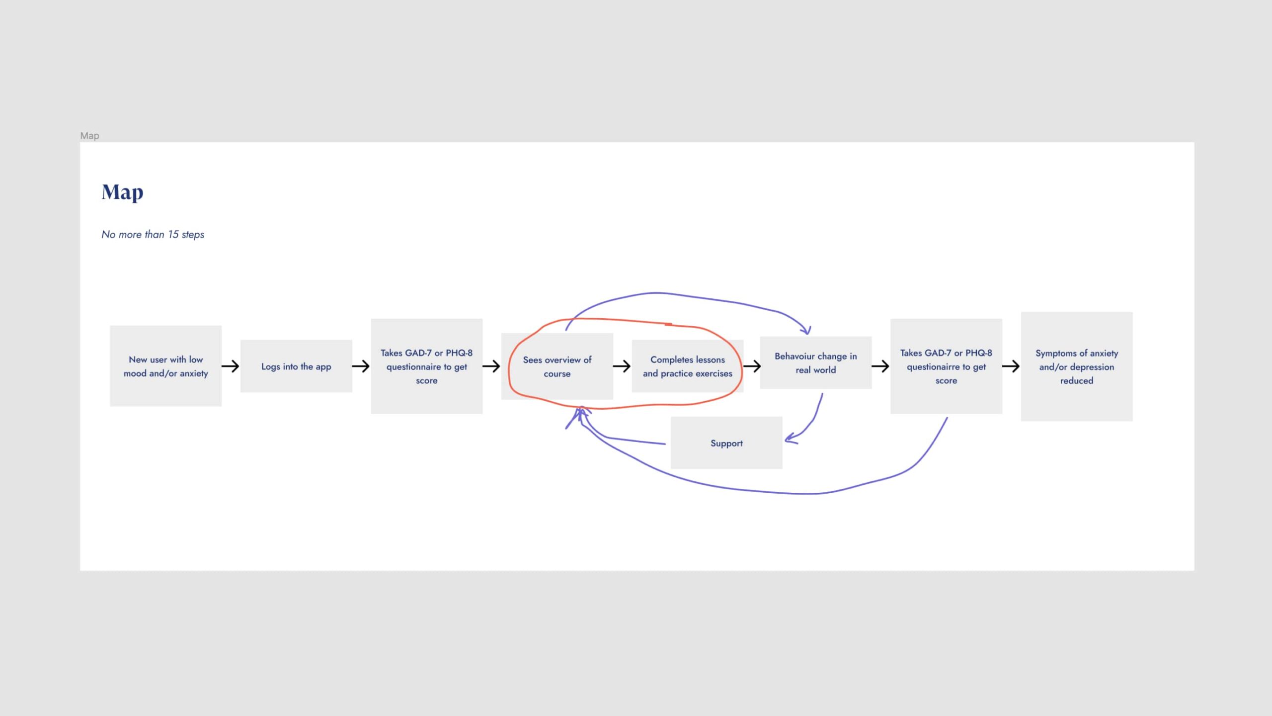
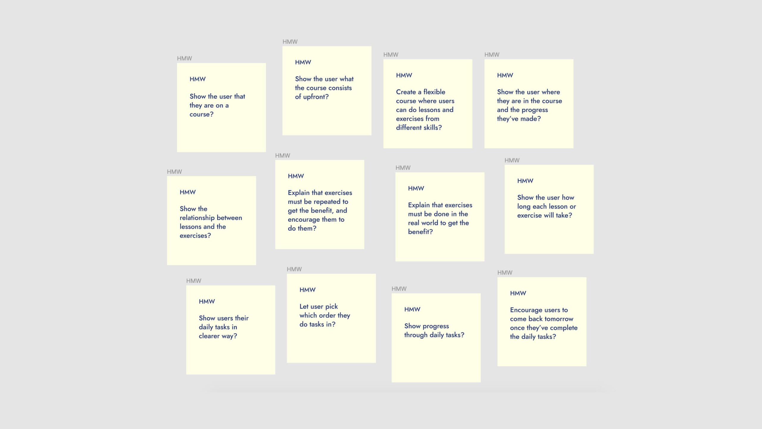
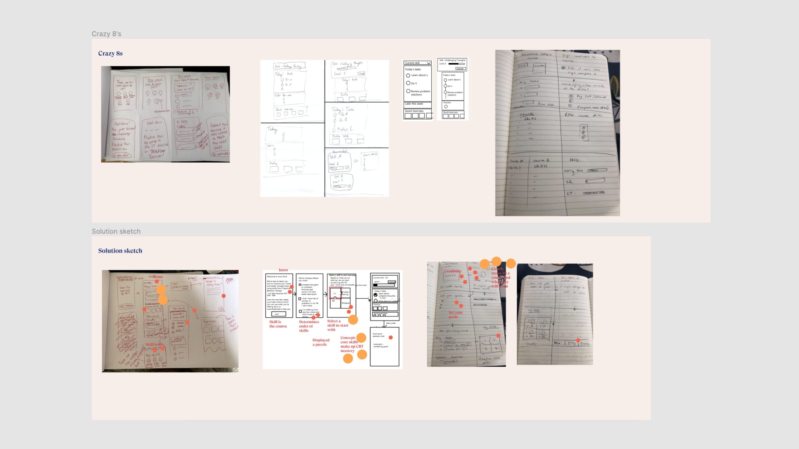
We drew up a rough user journey map, wrote out some How Might We's to highlight opportunity areas, and then sketched some ideas for key areas of the app. We then voted on our favourite ideas to develop further.
Some assumptions we wanted to test:
- The more psychoeducation the user completes, the more likely they are to reduce their GAD7 score.
- If we show the user an outline of the course upfront they will be more likely to complete the whole course.
- If we give the user a clear list of tasks each day they will be more likely to complete tasks.
Research & data
Pre launch insights
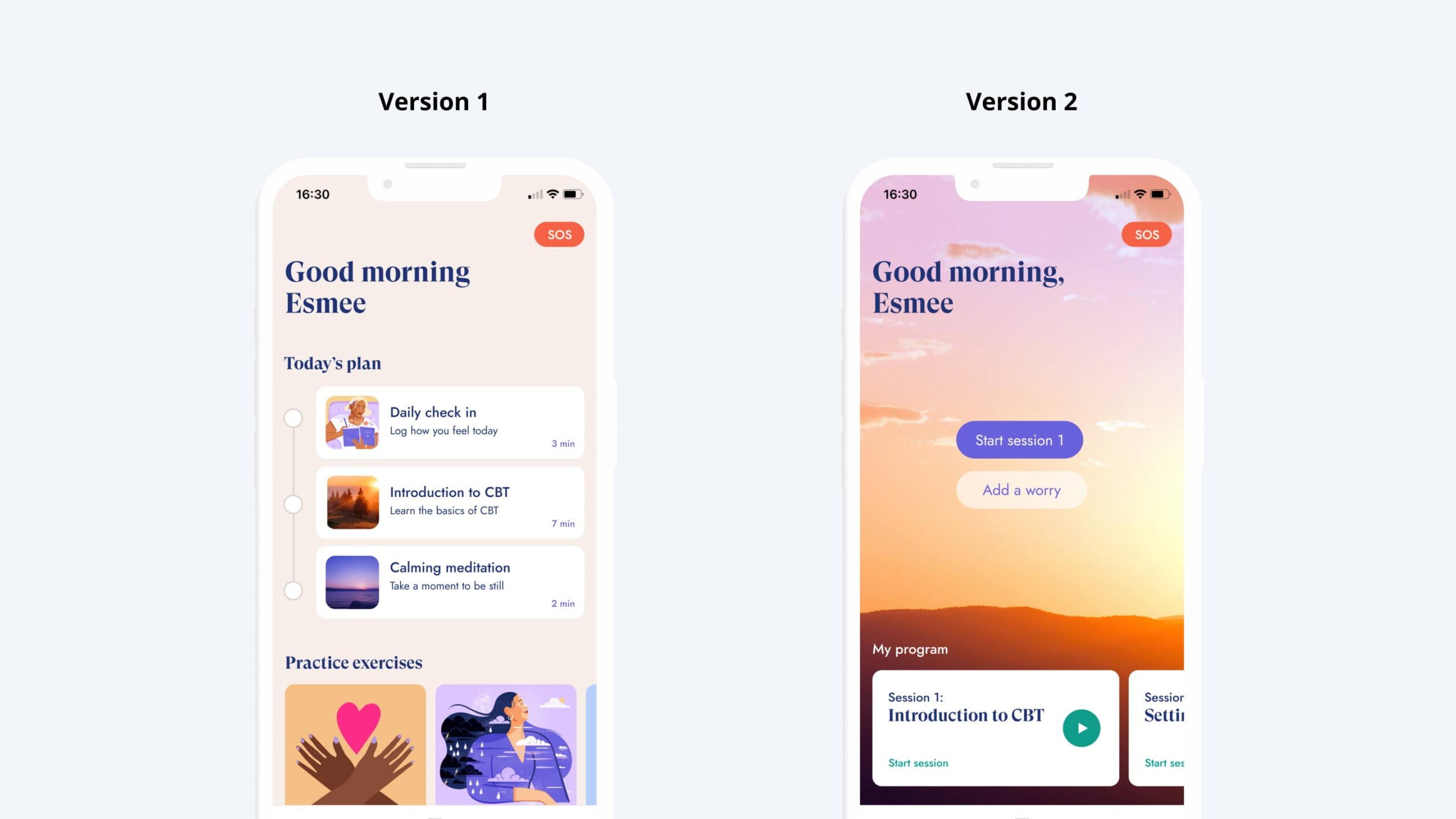
Once we had a rough prototype we showed it to some users to gather initial feedback. One insight was that a list of tasks on the homescreen overwhelmed some users. It didn't help their anxiety! Based on this feedback we scrapped the idea of daily tasks and designed therapy sessions to be completed in their own time (i.e. not set tasks for each day). To make the homescreen less overwhelming I changed the layout from a vertical tick list to a carousel.
Post launch
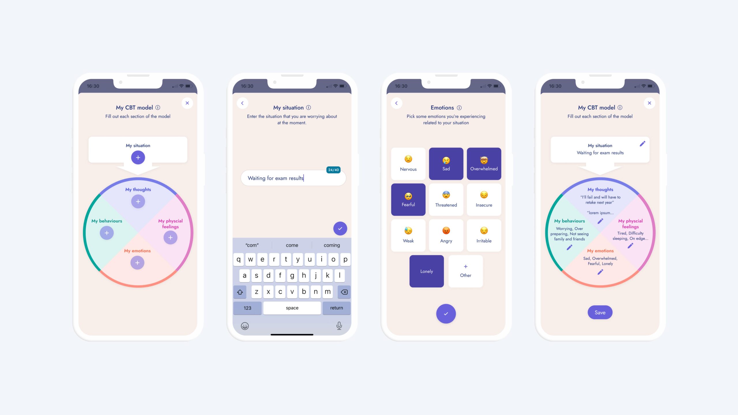
Post-launch, we found that users weren’t journaling many worries. User interviews showed this was due mainly to forgetfulness or other priorities.
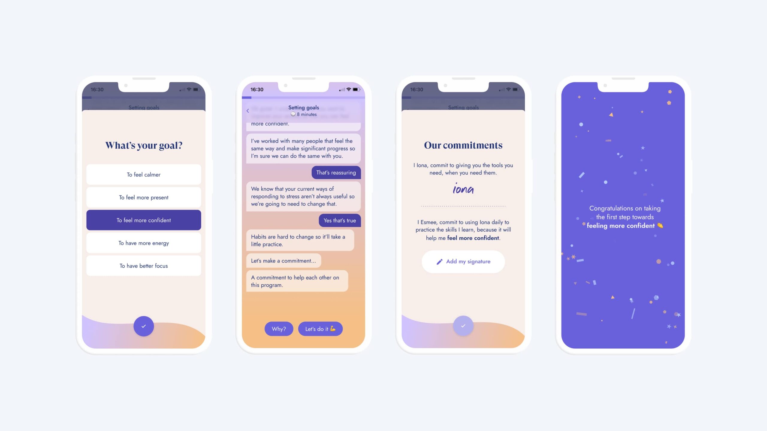
After reviewing the experience, it’s clear we weren’t setting user’s expectations during onboarding. For example, we weren’t explaining that effective CBT requires building new habits, and it would take commitment to the treatment plan to achieve their goals.
In response to this we added goal setting and a commitment statement to the onboarding. The aim was to highlight the user’s intrinsic motivations and prepare them for the effort ahead.
Results & learnings
- Working closely with a clinical specialist throughout the design process is crucial
- Be clear about the effort required for the treatment to work
- Show the user why they should trust the treatment
- When users share personal information (i.e. a worry), give a personalised response
